
7 Steps to Creating the Perfect Mood Board
Mood board making is one of the most important parts of my creative process. Whether I’m designing a wedding, a space, a brand concept or even kid’s birthday party, I always start with a mood board. The mood board forces you to narrow down your images to the very best, that support your vision and help you choose a color palette that compliments your look. This visual document becomes the north star for the entire design. In fact mood board making is sometimes my equivalent to doodling, it’s the method in which I use to play around with an idea and bring images together that will give me the clear picture I need to move forward. The mood board forces you to narrow down your images to the very best, that support your vision and help you choose a color palette that compliments your look. And if your project expends beyond personal use, you can use it to pitch your clients, to communicate your vision to your vendors or even share with your friends.
For my wedding planning business I not only offer wedding coordination, but I also offer wedding e-design, so I work with many clients from all over the country to create concepts for their special day. After making hundreds of mood boards I finally put pen to paper and wrote down my tried and true steps for creating a beautiful and effective mood board.
1. CHOOSE 3 WORDS TO DESCRIBE YOUR PROJECT
If you were describing how you want your project to feel to another person, what are the three words you would use first? Relaxed? Fun? Classic? When I begin a wedding design I listen carefully to the client for the words they use. Often they will say something like, “we just want this to be a fun party.” That tells me that they want an element of fun and probably relaxation. These word clues and ultimately the three words you choose will be a touchstone for the images you choose.
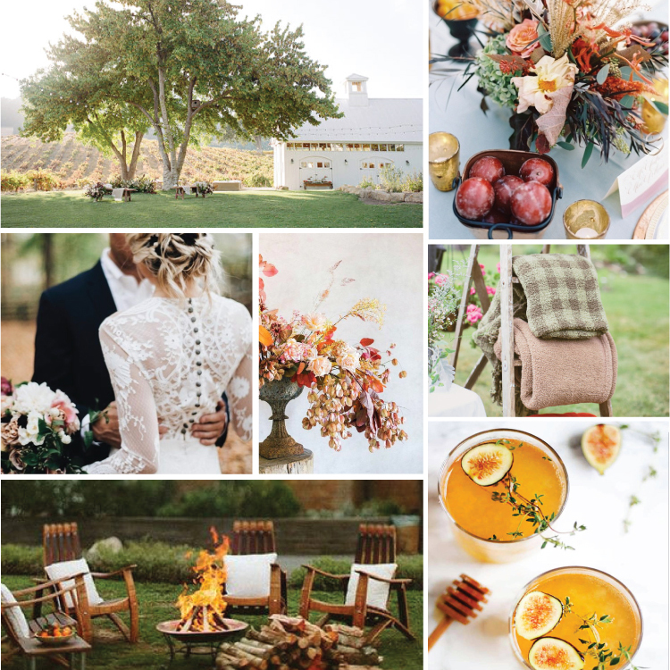
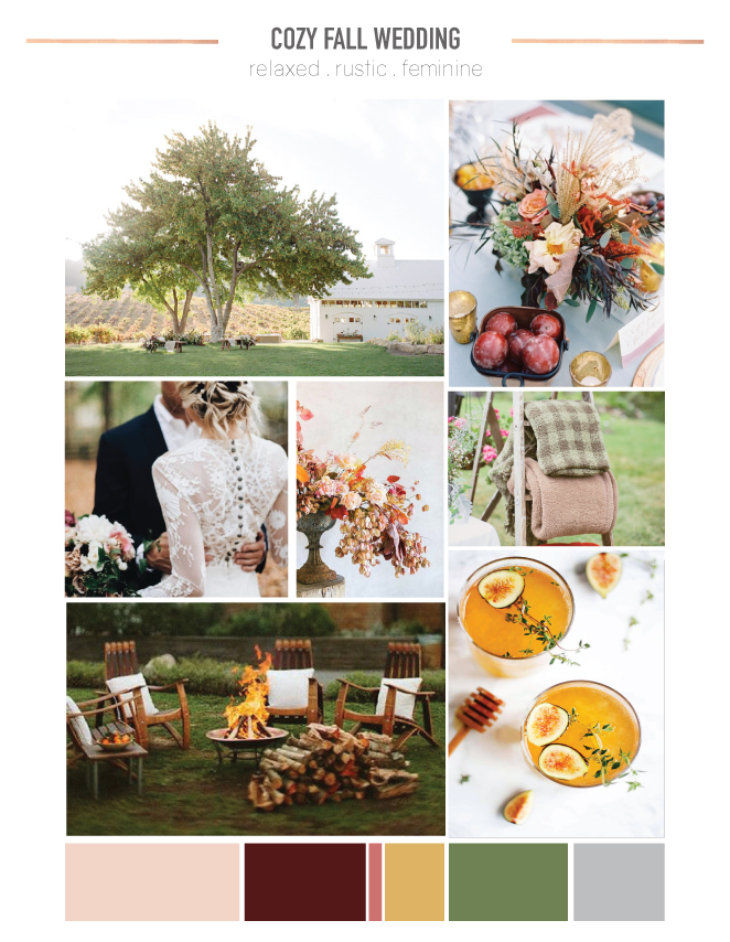 photos (clockwise from upper left): barn // table top // blankets // cocktail // bonfire // lace dress detail // floral arrangement
2. CREATE A PINTEREST BOARD
Or if Pinterest isn’t your jam, save all the images in a folder. Either way gather at least a 15 to 20 images that fit the vibes you describe with your words and vision you have in your mind’s eye.
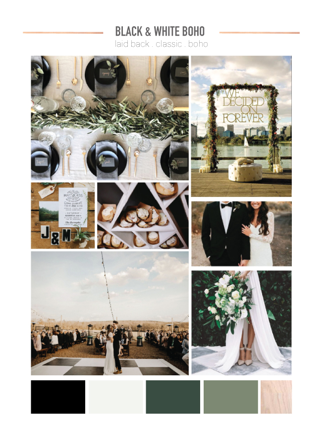 photos (clockwise from upper left): tablescape // typography backdrop // wedding portrait // bouquet and dress // dance floor // invitation suite // dessert display
3. OPEN THE PROGRAM YOU WILL USE
I use Adobe Illustrator because that’s what I am most comfortable with, but you can use Adobe Photoshop, InDesign, even Power Point or Google Slides will work too.
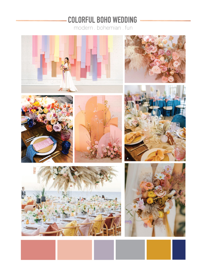 photos (clockwise from upper left): hanging fabric installation // fresh & dried floral instal // tablescape // bouquet // alfresco wedding // tablescape with blue napkin // arch installation
4. DOWNLOAD AND OPEN THE MOOD BOARD TEMPLATE
Download this mood board template for a simple map to guide you through the process. Start pasting your favorite 10 to 12 images, but don’t worry exactly where they will go just yet.
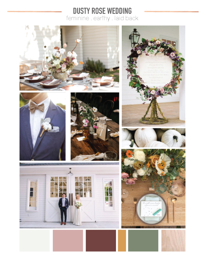 photos (clockwise from top left): centerpiece with cotton / floral wreath / pumpkins / place setting / modern farm house / groom’s suit / centerpieces on wood table
5. CHOOSE AND PLACE YOUR FEATURE IMAGE
Your feature image will be the one that best captures the essence of your vision. For weddings I like use an image of the venue or similar venue or a wide tablescape shot.
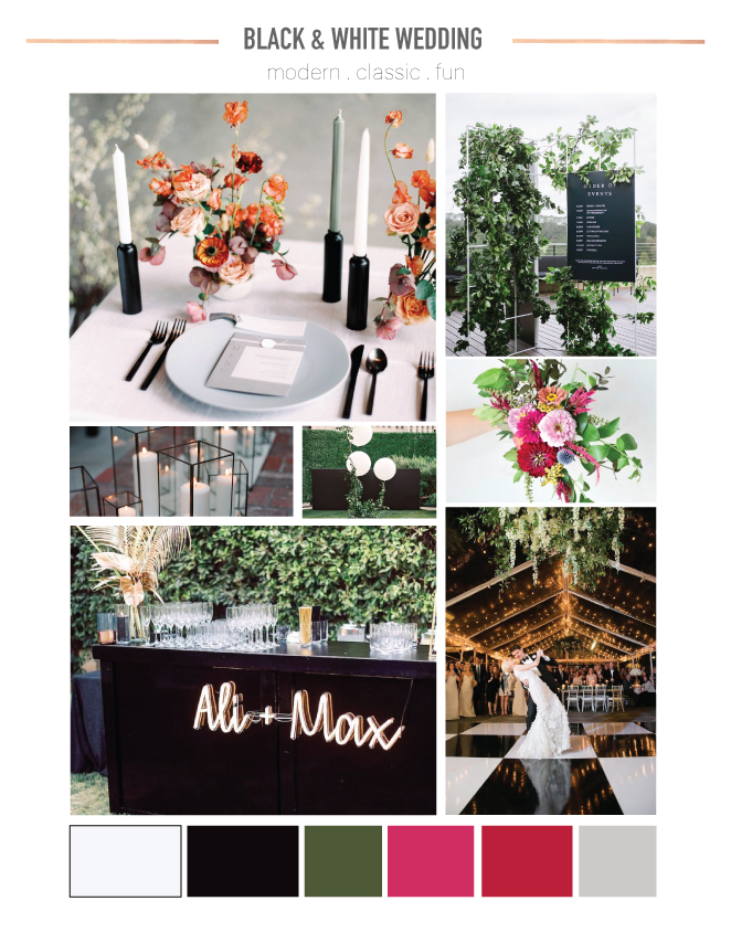 photos (clockwise from top left):tablescape // program sign // bouquet // dance floor // bar with sign // candles // balloons
6. BE SURE TO INCLUDE A VARIETY PHOTOS
Here is where I really like to utilize Pinterest. If you have an image you like on Pinterest and scroll down, they will show you more similar images. This is a great spot to find images of different angles, more close ups, or wide angles to vary your photos in the mood board. Don’t forget to add a few photos that are just for texture or mood.
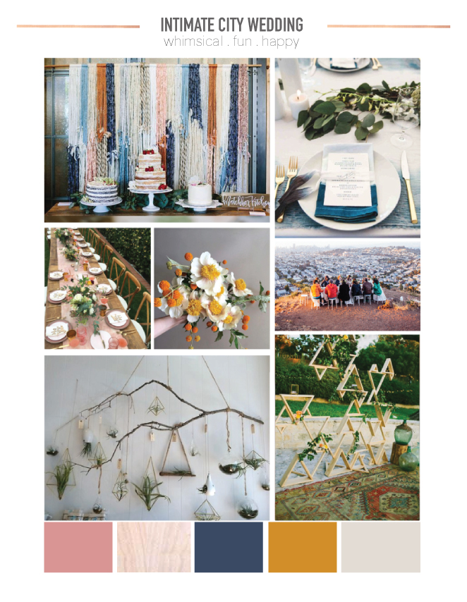
photo: yarn backdrop // dip dye place setting // pop-up dinner party // wooden backdrop // hanging plants // blush table top // bouquet
7. ADD YOUR COLOR Palette
If the program you are using has an eyedropper tool, I like to pull color straight from the photos. If you don’t have an eyedropper, that’s okay, find a tones and hues you like. I like to vary the widths of the color blocks to give weight and importance to the most prominent colors. I also like to add swatches of metallic, wood and other tactile materials.
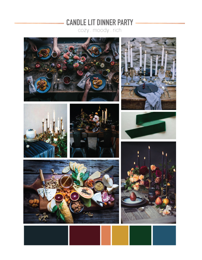 photos (clockwise from top): tablescape // candles // ribbon // Pear Place Setting // charcuterie board // candles + cake // metal chairs

If you’re still feeling like you need guidance to create the perfect day, please check out Lauren Koster Creative’s e-design services! We can create something custom for you!

Comments